- Only interested in measures aggregated and side by side, no lines/bars.
- Allows for multiple breakdowns (up to 5) similar to a Pivot Table in Excel or Tableau.
- See ALL the data.
Building a Data Table
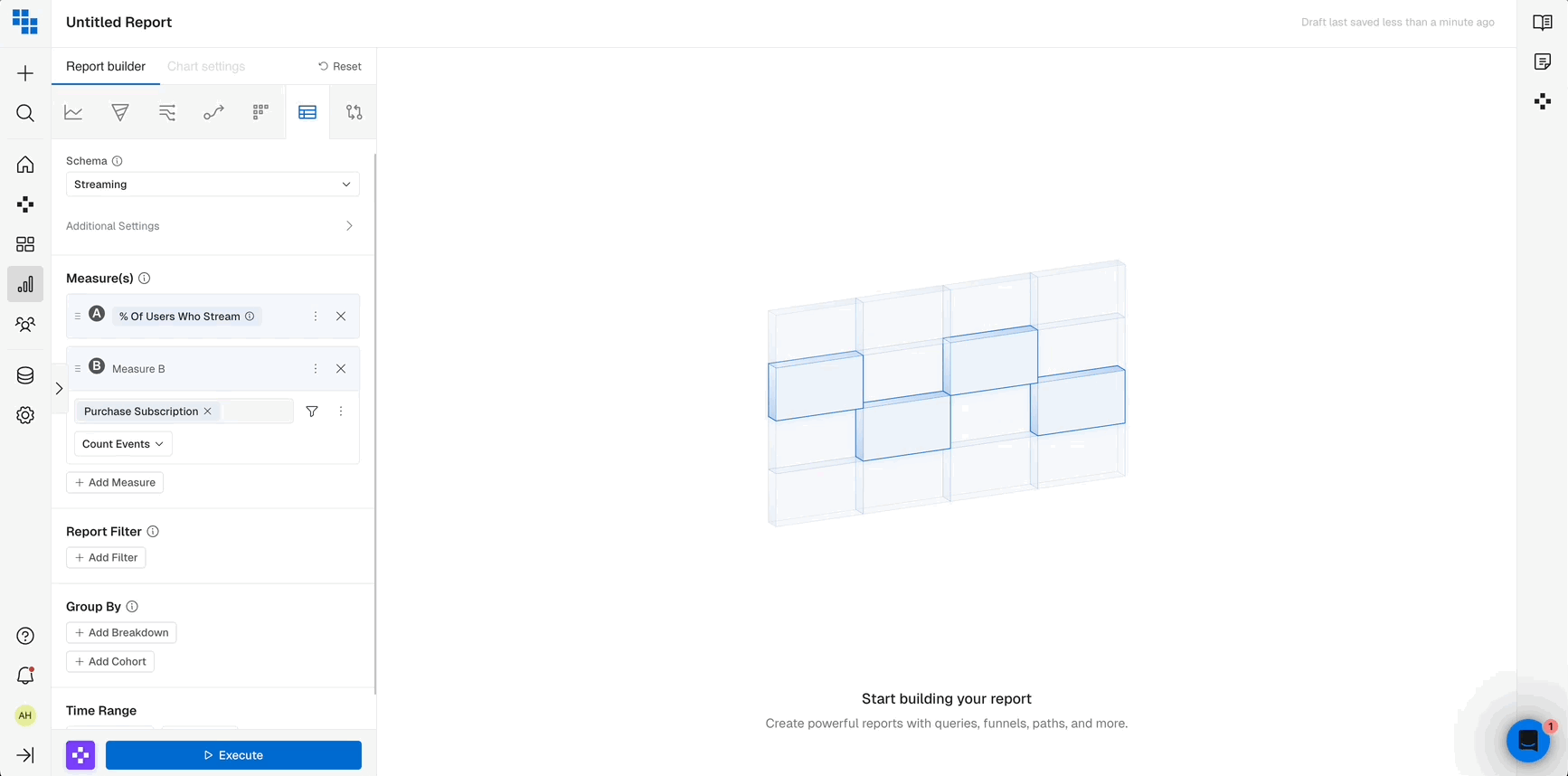
Data Table is similar to Query in that it’s made of Measures, Compound Measures and the standard filters/breakdown/segments.- Build the Measures you want to see aggregated directly within the data table.
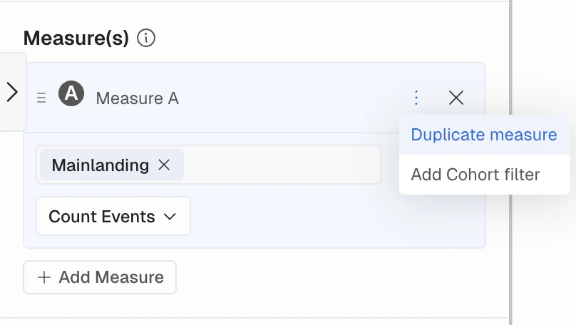
- If you want to create a separate measure similar to the one you have, you can easily duplicate and then change the parts you want.
- Select Saved Measures by clicking “Measure Options” and then “Add Named Measure” and select the one you want to use.
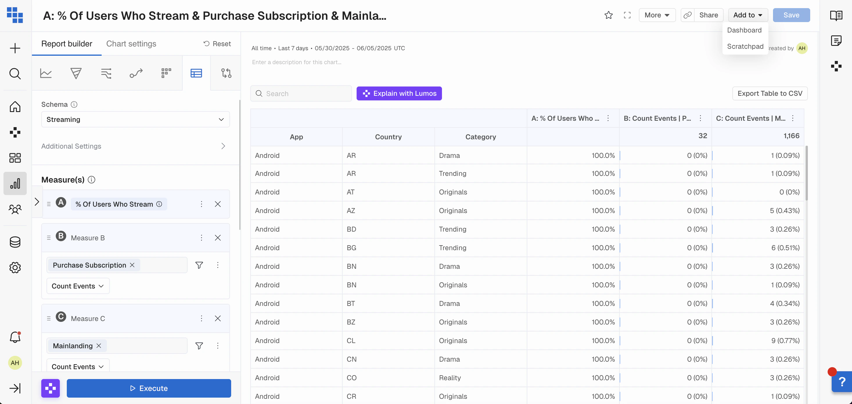
Data Table Results
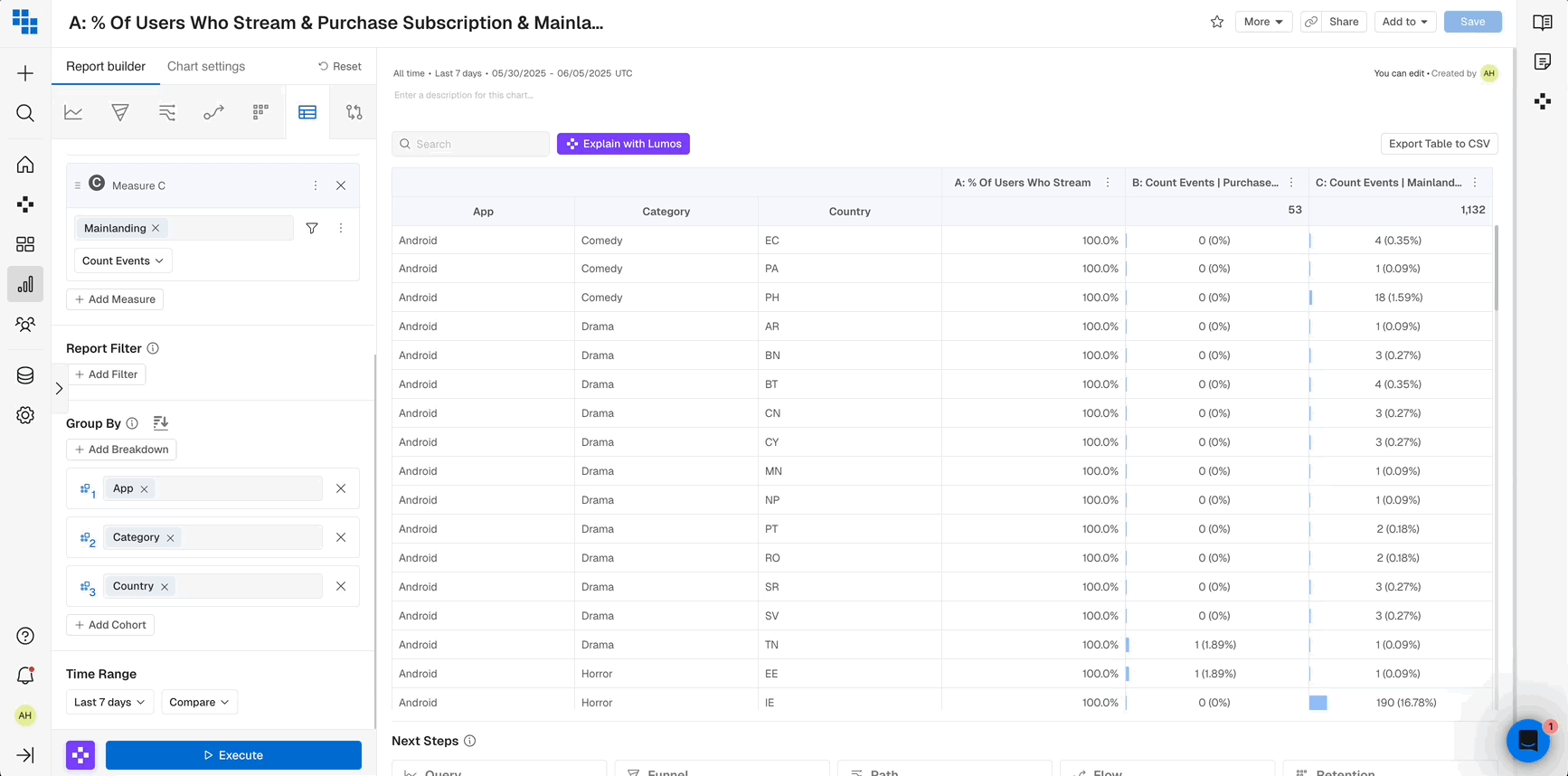
Once executed the result will be a pivoted view of:- Rows for each breakdown group you’ve applied.
- Columns for each Measure you’ve selected.
- Additional columns for any Segments you’ve applied.
Compare in Data Table
In the Data Table report, you can compare a measure against its previous day, week, month, quarter, year, or another custom date range. When constructing your Data Table:- Select a Compare range next to your report date picker.
- Execute your report.
- You’ll see a ‘Previous’ column containing the Compare date range data and a ‘Current’ column containing the report date picker data.
- You can also toggle on “Show % Change” above the table to visualize the change over time as a % with color formatting.
Additional Options
You are also able to:- Add the Data Table to a Dashboard.
- Export the Table to a CSV.
- Reset any sort or search filters applied.
Data Table FAQs
When should I use a Data Table?- Data Tables are great ways to aggregate data over periods of time, and compare metrics across various breakdown groups.
- If you want to see the aggregated metrics side by side for breakdown groups use a Data Table.
- If you want to see multiple Compound Measures you are able to add multiple Compound Measures on a Data Table.
- If you’re goal is to view information trended over time it’s better to use a Query report as that will show you data plotted over days, weeks, months etc.
- If you want to see data in a line, bar, pie chart, or stacked column you should use a Query report.
What’s Next